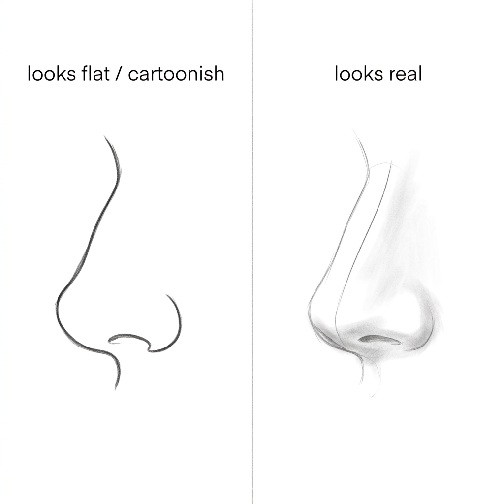
Clumpy shading almost always comes from pressure, not from a weak eye for tone. Pressing hard with one pencil crushes the paper tooth so the mark can’t be built on or lifted, and the surrounding lighter marks look patchy by comparison. Even tone comes from many light layers, built with different pencil grades, over a value map decided before you touch the mid-tones.
Clumpy shading is a pressure problem wearing a technique costume
Most self-taught artists build a dark area by pressing harder with the same pencil they used for the light areas. It works for a few strokes. The graphite goes down fast, the tone looks dark on first pass, and it feels efficient. This is so, but the paper has a texture called tooth, tiny raised fibers that hold graphite. A hard stroke flattens that tooth in one pass. Once it’s flat, there is nowhere left for more graphite to sit, so the area goes shiny and can’t take another layer. Blend it and the shine gets worse, because you’re pushing the little graphite that’s there into an even flatter sheet.
Meanwhile the mid-tones next to that dark patch were built more gently, with tooth still intact, so they still take graphite unevenly, in small grainy clusters. Put a flattened shiny dark next to a grainy mid-tone and the eye reads it as patchy, even though both areas are technically “shaded”. The reader assumes they can’t see values well. That’s rarely the actual fault. The actual fault is that one tool did two incompatible jobs: laying down tone and compressing it, at the same time, in the same pass.
The fix is not a better eye. It’s deciding the darkest dark and the lightest light before any mid-tone work starts, then building every value with light passes and a change of pencil grade, never a change of pressure. Pressure stays close to constant through the whole drawing. What changes is which pencil is in your hand.
Build the value map before a single mid-tone goes down
42 hours of pencil drawing training, lifetime access
The video course I point plateaued students to — full lessons on portraits, hands, and realistic shading, not another short tutorial.
- Light construction lines only. The shapes are on the paper: proportions, major forms, the direction of edges. No shading yet. Nothing is dark, nothing is textured.
- Mark the single darkest dark. Find the one area in the reference that is genuinely darkest, usually a cast shadow or a deep crease, and place a small patch of it now, at close to full pencil grade. This is the anchor every other value gets compared against. Nothing else on the page is this dark yet.
- Mark the single lightest light. The brightest highlight, often left as bare paper or barely touched. Now the two ends of the value range exist on paper, and every mid-tone you add gets judged against both, not guessed in isolation.
- Block in the broad mid-tones with a soft, light-grade pencil. Cover the middle values in loose, even layers, changing stroke direction each pass instead of scrubbing back and forth in one direction. The shapes are roughed in tonally now; individual forms like folds or muscle groups are not yet separated.
- Separate the mid-tones into distinct forms with a harder grade. Switch pencils to add the tone that reads as one plane turning into another. This is where form starts to look three-dimensional instead of just gray. Edges between values are still soft.
- Push the true darks up toward the anchor value with a softer grade again. Build them in thin layers, not one heavy pass, so the tooth of the paper is still there to hold the final layer.
- Blend last, and only where the reference is genuinely soft. A tissue, a blending stump or a finger, used sparingly, on the transition areas only. Hard edges (where a form meets a cast shadow) stay unblended.
A held-at-arm’s-length squint catches a broken value map before the darks go in
Squint at the drawing from a short distance. This blurs detail and leaves only value. If the squinted drawing reads as a flat gray shape with no sense of which area is closest to black and which is closest to white, the value map from step 2 and step 3 was skipped or not committed to. Failed check looks like: everything sits in the middle of the range, nothing reads as truly dark or truly light.
Hold the drawing at a low angle to a light source, almost flat, and look along the surface. Flattened, shiny areas catch the light and look glossy compared to the matte areas around them. Failed check looks like: one or two patches gleam back at you while the rest of the page looks dry and textured.
Compare the darkest mark on the page to the anchor dark you placed in step 2. If a later dark area has gone shinier or flatter than that first anchor, the paper tooth in that spot is gone and no amount of added pencil will deepen it further. Failed check looks like: pressing harder in that spot does nothing, the pencil just slides.
Run a finger very lightly over the shaded area (not the highlight areas) and feel for a slick, glassy patch versus a slightly toothy one. Failed check looks like: one area feels noticeably smoother under a fingertip than the rest of the tonal range, which is the paper telling you it’s compressed.
Flip the drawing to grayscale in a phone camera or photo app. Color of the graphite doesn’t matter here, but grayscale strips away the last bit of forgiveness the eye gives a drawing in normal light. Failed check looks like: bands of value suddenly become visible where before it looked like a smooth gradient.
Over-blending erases the tooth that later layers need
42 hours of pencil drawing training, lifetime access
The video course I point plateaued students to — full lessons on portraits, hands, and realistic shading, not another short tutorial.
Blending is treated as the finishing move that makes shading look “professional.” Used early or used everywhere, it does the opposite of what you want: it pushes the graphite particles flat and fills the paper tooth, so any layer added afterward sits on a slick surface and won’t hold. Blend last, blend only the soft transitions, and leave hard edges alone.
Outlines that stay visible under the tone are a second common mistake. A construction line drawn dark and then shaded over doesn’t disappear, it just goes gray, and gray line plus gray tone reads as a cartoon outline sitting on top of a photo-real value. Construction lines should be light enough from the start that the mid-tone values built in step 4 and 5 cover them completely, not dark enough that they need to be erased later.
Pressing harder for a “quick dark” instead of switching pencil grade is the mistake this whole article is built around, and it deserves repeating on its own: pressure crushes tooth, grade changes value. Keep pressure close to constant and change the tool in your hand.
The honest limit here is paper tooth itself: some papers simply don’t hold more than three or four layers before they’re saturated, no matter how careful the pressure and grade choices are. If a drawing has been reworked many times in the same area and still won’t go darker, that’s not a shading skill problem, it’s the sheet. This build order also isn’t the right fit for someone working loose, gestural or stylized shading on purpose, where the “clumpy” look is the intended texture rather than an error to fix.
Thirty minutes on one small dark shape teaches the pressure habit faster than a full drawing
Tonight: pick one small, simple form, a single sphere or a folded piece of cloth, nothing with a full figure’s worth of edges to manage. Spend the full session on values alone: place the darkest dark, place the lightest light, then build only two mid-tone layers between them with different pencils, keeping pressure the same the whole time. Stop before the session turns into a full rendered drawing. The goal is repetitions of the pressure habit, not a finished piece.
After a month of this practice most self-taught artists stop reaching for pressure as the first tool. The hand starts reaching for a different pencil instead of pressing harder, without having to think about it mid-drawing. Full drawings also start further along already, because the value map gets committed to in the first few minutes instead of being patched in wherever it looks thin near the end.
Common questions on shading gone wrong
Why does my shading look patchy?
Usually because different areas of the same drawing were built with different amounts of pressure. Heavily pressed areas flatten the paper tooth and go shiny; lightly pressed areas keep their texture and look grainy. Next to each other, the eye reads the mismatch as patchiness even when the actual values are close to correct.
What pencils do I actually need?
A small range from soft to hard is enough to build a full value map without leaning on pressure: something soft for the broad mid-tone blocking, something in the middle for separating forms, and something for the deepest darks in the final layers. More pencils than that add choice without adding control.
Should I blend with a tissue or a stump?
Either works on soft transitions; the tool matters less than the timing. Blend last, after the value map and mid-tones are already built, and only over areas that are genuinely soft in the reference. Blending early or blending hard edges is what causes the flat, overworked look, not the choice of tissue versus stump.
Why do my darks look shiny?
The paper tooth in that spot has been pressed flat, usually from pushing hard with one pencil to get a fast dark. Once the tooth is gone, graphite sits on top of a smooth surface instead of catching in fiber, which reflects light back as shine instead of absorbing it as matte tone.
How long should a realistic drawing take?
The total time matters less than the order: value map first, mid-tones in light layers second, blending last. A drawing built in that order rarely needs the heavy rework that eats most of the hours.