Most portrait redos start in the wrong place. You erase the nose three times. You nudge the mouth half an inch left. You shade for another hour, and the face still refuses to look like the reference. The feature that was wrong was never the nose or the mouth. It was where you put them on the face in the first place, and no amount of redrawing a single feature can undo that.
I count what people ask about on drawing forums. In my own sweep of 6,641 posts, 837 of them mention a face, a head or a portrait. Of those, 145 blame proportion and placement. Only 113 blame shading. Placement breaks first, and it breaks quietly.
That is why every graded drawing course starts here. Placement is the one part of a portrait you cannot fix later. The four rules below catch the error before you shade a single feature.
A portrait fails at the placement stage, not the shading stage. Four measurements decide whether a face reads as a likeness, and all four happen before any shading.
The same order works on a single eye and on hands. Structure first, surface second. It is the same order behind anatomy for self-taught artists and quick sketching.
 Pin it
What Do You Need to Draw a Portrait?
Quick answer: an HB pencil for placement, a 2B to 4B for shading, a kneaded eraser, and a reference photo on a separate surface from your paper. Nothing else is required to start.
The eraser matters more than the pencil. I buy one kneaded eraser for every two pencils I go through.
Placement is a run of small corrections, never one confident line. A kneaded eraser lifts graphite cleanly, so you can redraw a feature two or three times without scarring the paper.
A stiff plastic eraser smears instead of lifting. Every correction becomes a smudge you then have to work around.
If none of this feels familiar, run through basic beginner drawing habits before you try a full face.
I keep my reference propped on a second surface, never on the page I am working on.
Do the same. When the photo sits on the same sheet or screen you are drawing on, your eye compares angles that are not comparable. The two are never at the same scale or the same distance unless you place them side by side.
None of this is expensive. None of it is what holds your portrait back.
What a pencil case cannot do is tell you which of the four measurements is off in the drawing in front of you. That is the one thing a graded drawing course gives you and a materials list never will.
Paper matters less than you expect. Mid-weight drawing paper, heavy enough to survive repeated erasing, covers everything here.
Toned surfaces and a favourite brand of graphite will not fix a placement error. Add them once placement stops being your bottleneck, not before.
One more thing worth having: a light grid, drawn on the reference or overlaid digitally. You do not need it for the rules below. It gives you a second way to check a measurement when your eye feels unsure.
If a face still feels like too much, start where placement errors cost less. Simple flowers teach the same measure-before-outline habit.
Why Rules, Not Just Steps
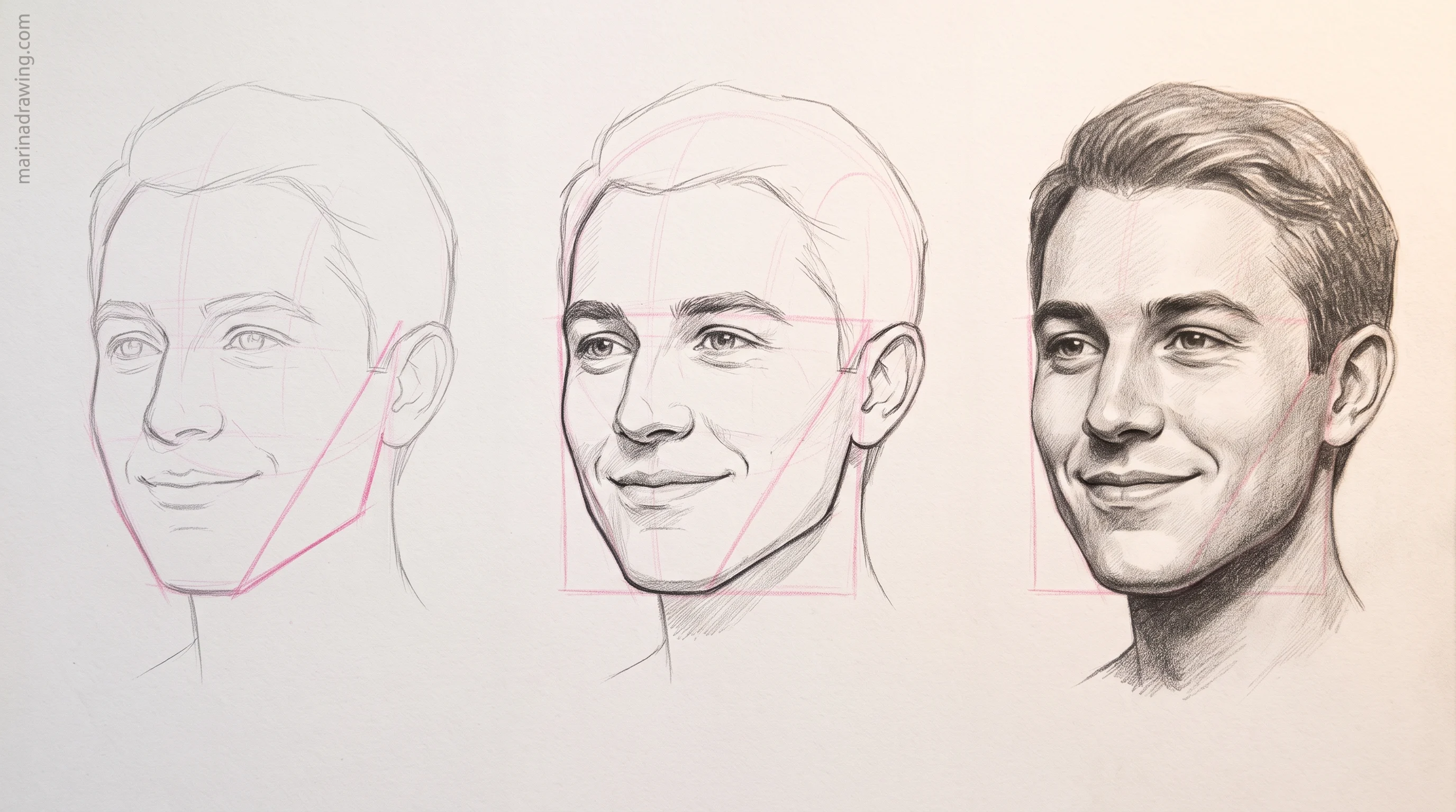
Steps show you what a finished face looked like for someone else. Rules show you why it worked.
A numbered list tells you what to draw next. It never tells you how to check whether what you just drew is in the right place. That check is exactly what is missing from most beginner attempts.
Rules answer a different question. Not “what comes next” but “is this correct so far.”
Here is the frustration I hear most. You follow a tutorial in order, you finish, and the face still does not look like the person. You did the steps right. No rule caught the placement error on the way, so it compounded from one feature to the next.
Every feature on a face gets measured against features already on your page, not against the photo directly.
Draw the eyes slightly too high and the nose gets measured against a wrong eye-line. Then the mouth gets measured against a wrong nose.
By the end nothing looks obviously wrong on its own. The whole face is just quietly off, and that is why you cannot name what to fix.
This is also why redrawing one feature over and over rarely helps. The mouth looks wrong, so you erase the mouth. But if the mouth is correct relative to a nose that sits too low, no amount of reshaping saves it.
Fix it one layer up, at the feature the current one was measured against.
Portraits share this with anything built from interlocking parts. Hands, feet, a full figure. An early error never stays where it happened.
That is the argument for rules over steps. A rule catches the spread. A step just tells you to keep going.
Rules also stop progress feeling random. You can name a rule you broke, and a named failure is something you can practise on purpose. That is what a structured practice sequence is for, once the four rules are familiar.
The same order runs well past faces. It is why hands fail for identical reasons.
Rules tell you what to check. They cannot tell you which one you keep breaking. That gap is what a graded drawing course fills, because someone is looking at your drawing instead of at the rule.
Why Portrait Drawing Is Harder Than Anything Else You Draw
42 hours of pencil drawing training, lifetime access
The video course I point plateaued students to — full lessons on portraits, hands, and realistic shading, not another short tutorial.
A mug drawn slightly wrong is still a mug. A face drawn slightly wrong is a stranger.
Three things make faces harder, and none of them is rendering:
- Your viewer is an expert. Everyone has read faces their whole life. A three-millimetre error in eye spacing is invisible on a teapot and obvious on a person.
- Errors are relational. Nothing about the nose is wrong on its own. It is wrong next to the eyes. That is why erasing it never helps.
- Likeness is judged instantly. Nobody studies a portrait first. The verdict lands in about a second, before your shading gets noticed at all.
So time you spend improving your shading will not improve your likeness.
They are separate skills sharing one page. Placement decides recognition. Shading decides polish. Work in that order and the same hour of practice buys far more.
This is also why the fix is measurable, not mysterious. “Something looks off” is not a talent problem. It is one of four measurements, and you can check each one in under a minute.
A structured course that reviews your own sketches shortens that loop, because someone names which of the four is off before you spend an hour shading it.
Measuring only works if your hand can hold a light, even line. Short daily practice builds that faster than one long session.
The Placement Rules That Actually Matter
 Pin it
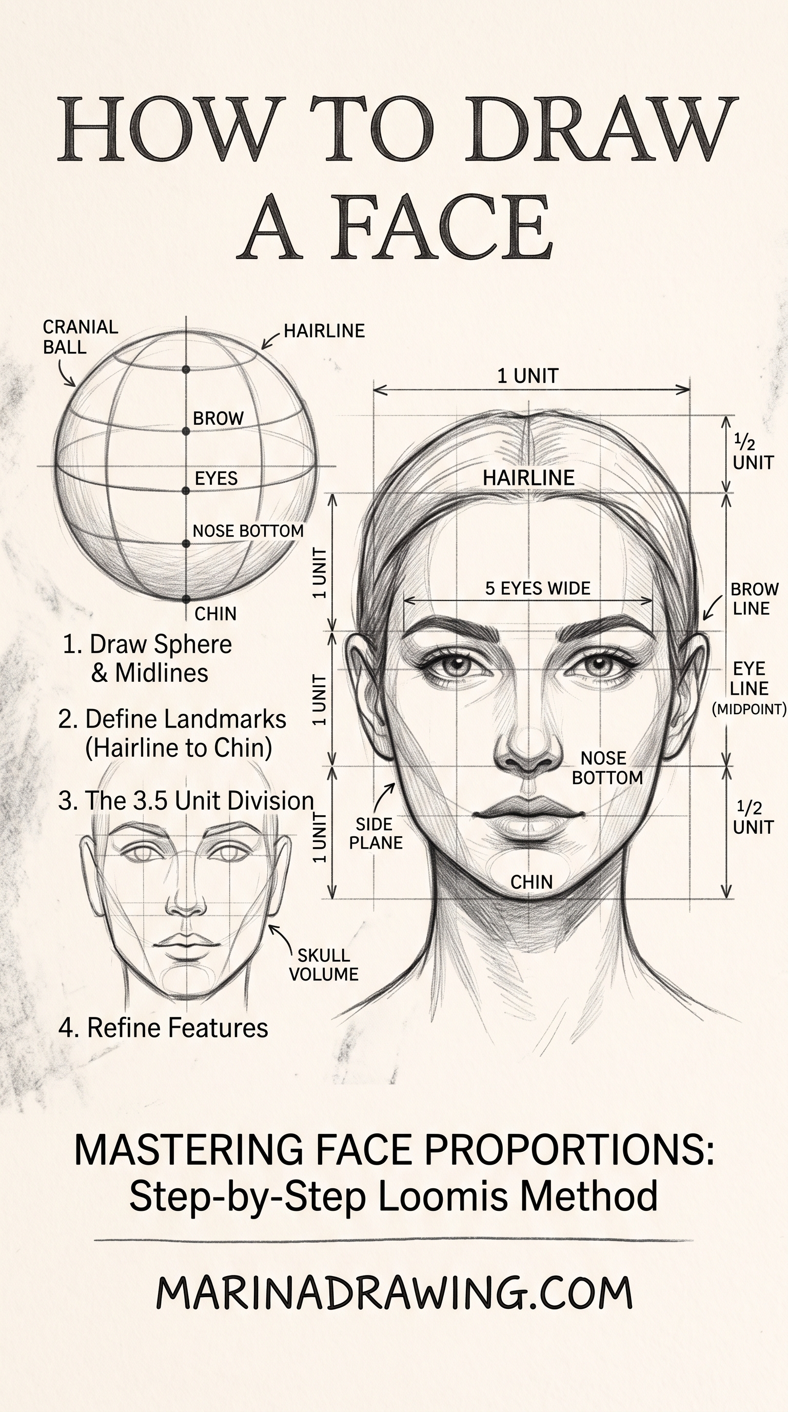
1. The eye-line sits at the halfway point of the head
Not halfway up the face. Halfway up the whole head, hair and back of the skull included.
You probably place it too high, because you measure against the visible face alone. Then you add hair and the eyes look stranded near the top of the head. Measure this before you decide how hair volume sits, not after.
2. One eye-width separates the eyes
The gap between the inner corners is roughly one eye wide.
Narrower and the face reads as cross-eyed, even with perfectly shaped eyes. Wider and it reads as startled. Both are placement errors, not shape errors.
The first two rules are easy to apply and easy to believe you applied. If the face still reads wrong after both check out, a marked drawing from a graded drawing course usually finds the answer in rule three or four.
 Pin it
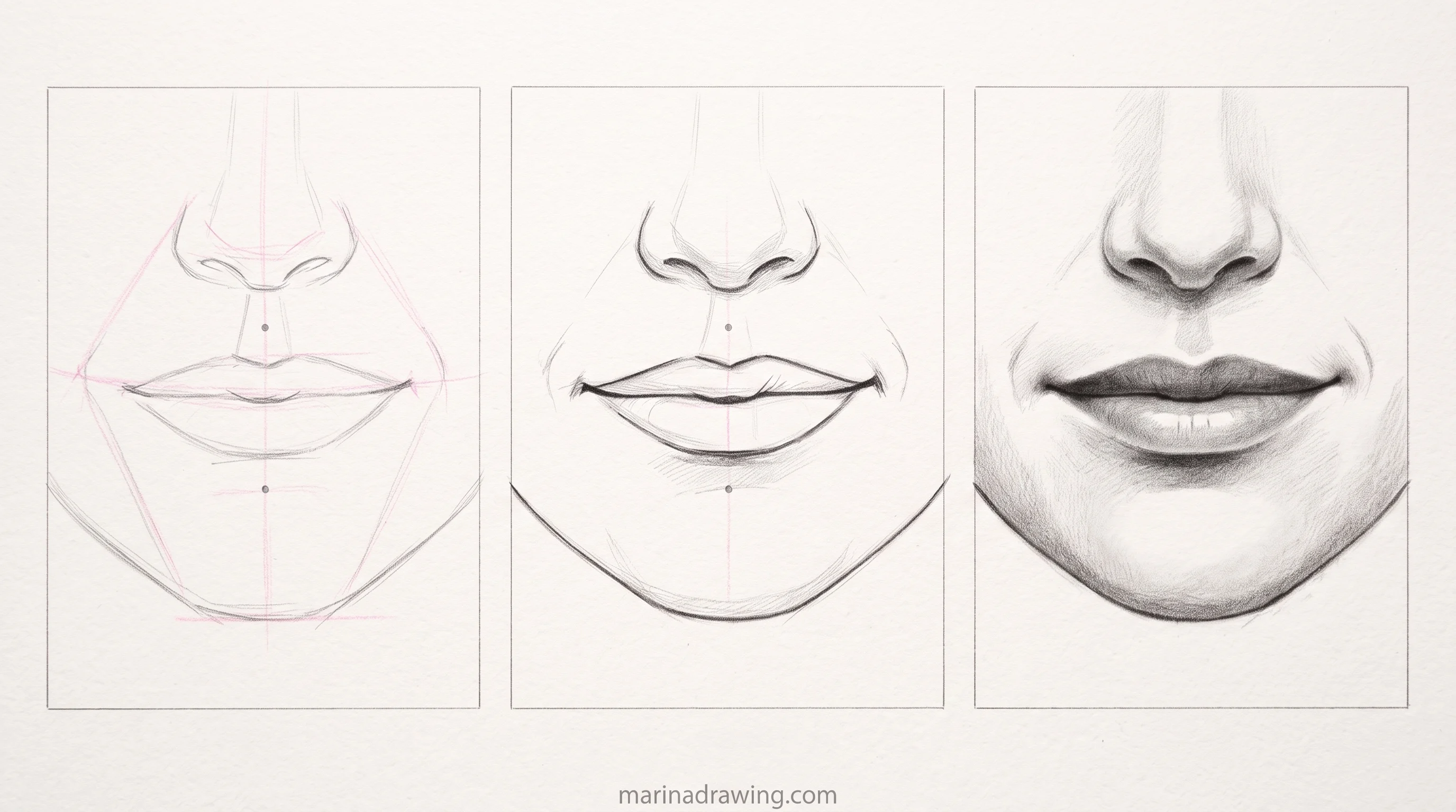
3. The nose base sits halfway between the eye-line and the chin
This one measurement decides whether your whole lower face reads as proportioned.
Too high and the mouth and chin get crowded into too little space. Too low and the mouth looks small and pushed down.
4. The mouth sits about a third of the way from the nose base to the chin
Not halfway. Closer to the nose than to the chin.
Centring the mouth is one of the most common single errors I see in a beginner portrait. It looks reasonable on its own and only reads as wrong next to the rest of the face.
All four rules share one property. Each measures a feature against another feature already on your page, never against the photo from memory.
That is what makes them checkable mid-drawing. A rule you can test on your own paper beats a step you are told to trust.
Run all four in order, not as one check at the end. The eye-line has to hold before the nose-base rule means anything, because you take the nose measurement from the eye-line.
Think of the four as a chain, not a checklist. A checklist implies you can verify each item alone. A chain means one early link breaks every link after it, however carefully you measured the later ones.
So the eye-line deserves the most scrutiny of the four, even though it looks like the easiest to get right.
The same first-link logic helps on any multi-object setup. A portrait is really a still life of features measured against each other.
Reading the four rules is the easy half. Applying them to the face in front of you is the other half, and spotting which rule is off when the drawing still feels wrong is where a second pair of eyes pays for itself. That is what a graded drawing course gives you that a rule list cannot.
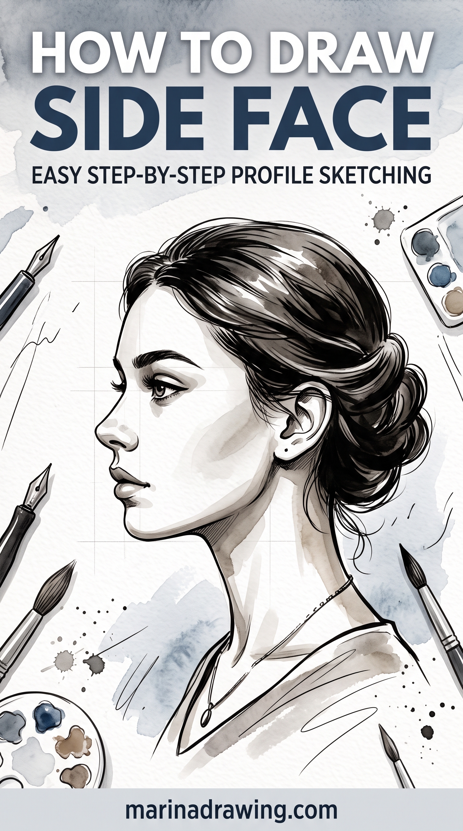
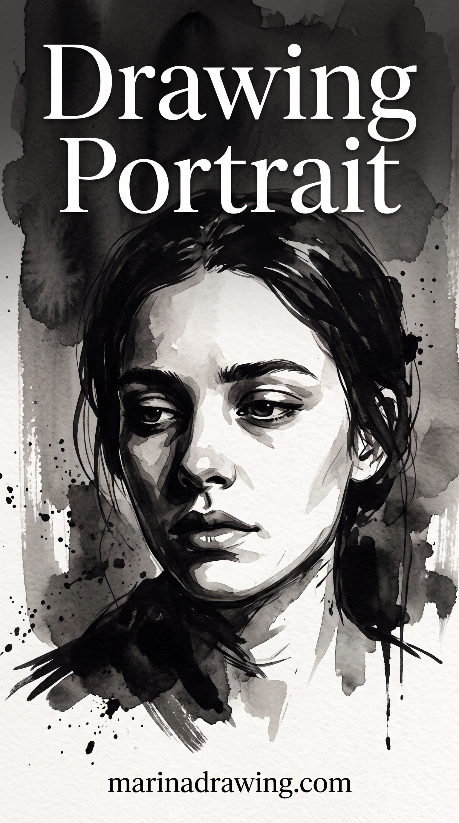
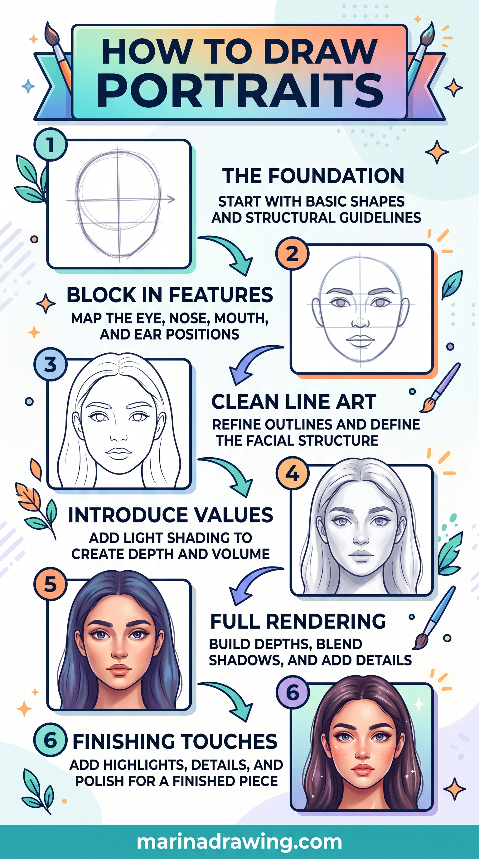
How to Draw a Face Step by Step: The Order That Keeps Placement Safe
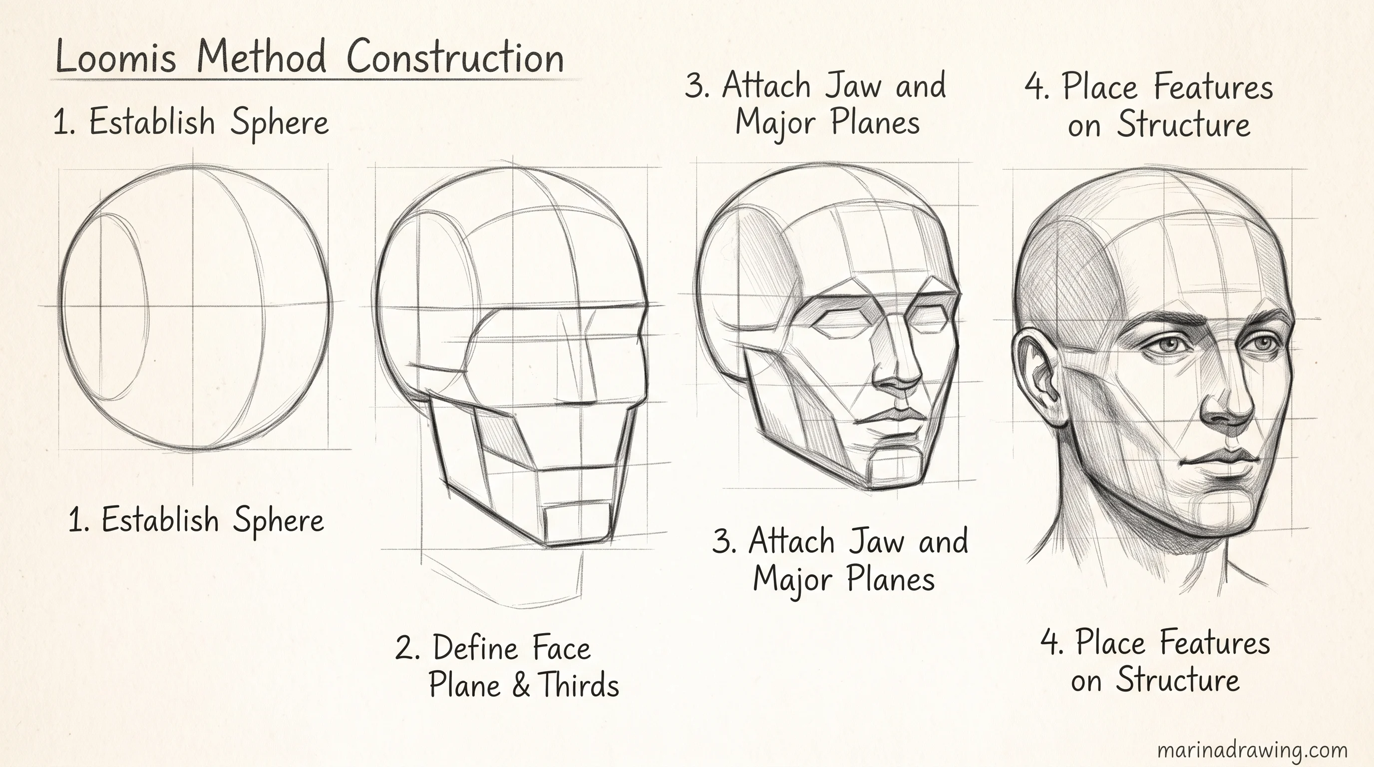
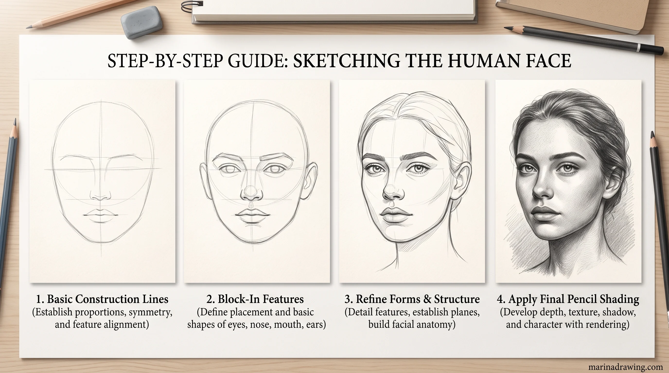
The rules say where things go. This is the order to put them down in, so an early error never gets buried under a later one.
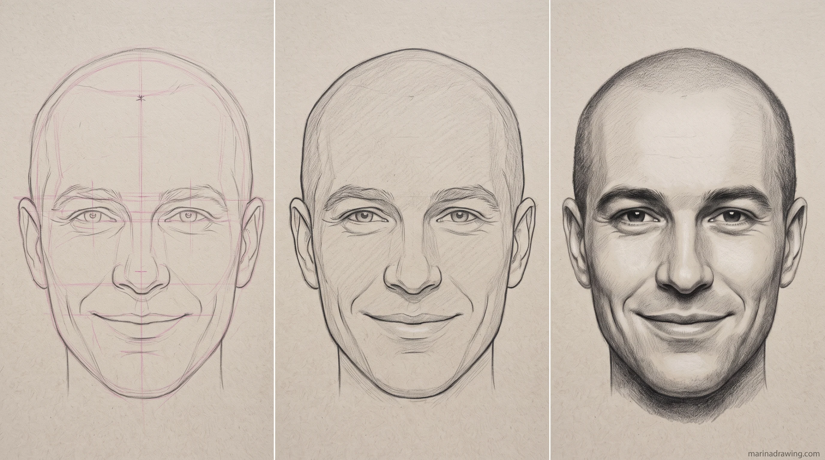
- Block the head shape. One light oval plus the jaw, no features. Keep the pencil barely touching the paper. Everything here will move at least once.
- Draw the eye-line across the middle. Halfway between the top of the skull and the bottom of the chin, with hair volume inside the skull, not sitting on top of it.
- Mark the chin line and halve it. The halfway point is your nose base. Mark it before you draw any nose.
- Divide nose base to chin into thirds. The mouth line sits on the upper third, not the middle.
- Place the eyes with a width check. One eye-width between them, measured with the pencil, not judged by eye.
- Stop and compare at arm’s length. Four measurements, one at a time, against the reference. This is your last cheap moment to be wrong.
- Only now draw the real contours. Lids, nostrils, lips, over the marks and not instead of them.
- Shade last. Light on the shadow side first, darks last, after placement has already passed the check.
Most people invert steps six and seven. Contours go down first because they look like progress, and the check happens later, when moving anything means erasing twenty minutes of work.
Run the check while the page is still faint marks. Failing it costs you nothing.
I lost my own first year of portraits to that inversion, and nothing else in my practice changed as much as moving the check earlier.
Two habits make the order stick. Draw every stage lightly enough that a kneaded eraser lifts it in one pass. Keep the reference on a separate surface so your eye always travels the same distance.
Neither needs new supplies. Both remove most of the reason people abandon a portrait halfway.
If the order keeps collapsing under your own hand, that is where a course built around graded practice sketches earns its place. Not for the theory, which is above, but for someone looking at your page and naming the step you skipped.
Once placement holds, practise tone next. It is the same order that simple beginner subjects teach before any face gets attempted.
12 Mistakes That Are Quietly Ruining Your Portraits
42 hours of pencil drawing training, lifetime access
The video course I point plateaued students to — full lessons on portraits, hands, and realistic shading, not another short tutorial.
 Pin it
1. Placing the eye-line at the top of the visible face
Covered above. The single most common placement error, and the root cause of several mistakes further down this list.
2. Drawing each eye as a separate exercise
Measure the two eyes against each other constantly while you refine either one. Finish one eye before you start the second and you almost always get a mismatch in size or angle.
Measuring by eye fails on any subject. It is the same error that flattens a still life setup when you draw the objects one at a time.
 Pin it
3. Guessing the nose width instead of measuring it
On most faces the base of the nose lines up with the inner corners of the eyes. Guess that width from habit and you end up with a nose that reads as too narrow or too wide for everything around it.
4. Centring the mouth exactly between nose and chin
Named above, and worth repeating. It is one of the easiest mistakes to make without noticing, because a centred mouth looks fine on its own.
5. Inking a feature before checking it against its neighbours
An inked line stops being adjustable. Every later feature then gets measured against an error you have just made permanent. Check your pencil placement fully before any ink touches the page.
 Pin it
6. Copying the outline instead of the proportions
Tracing the visible contour reproduces a shape without the proportions underneath it. That gap widens fast when your photo has lens distortion or an unusual angle.
Mistakes one to six are measuring mistakes. The next six are habits, and habits are easier to see in a subject you are not attached to. That is why a plain beginner subject is still worth drawing after you have started faces.
Spotting which of the six you personally repeat is the hard part. Feedback inside a graded drawing course does it in one marked drawing.
7. Shading before placement is confirmed
Shading is slow to undo. Start it early and a placement correction means redoing finished work, not one eraser pass on a pencil line.
8. Ignoring the jawline’s effect on face shape
Correctly placed features still look wrong inside a jaw of the wrong width or angle. Your features sit inside a container. Get the container wrong and correct placement inside it does not save you.
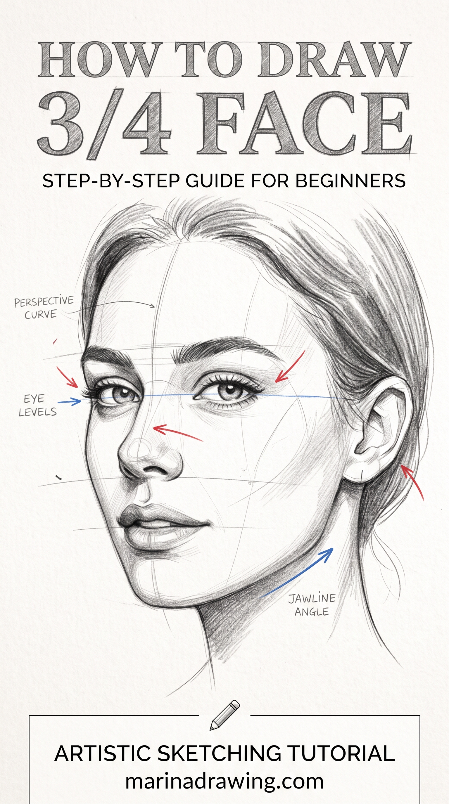
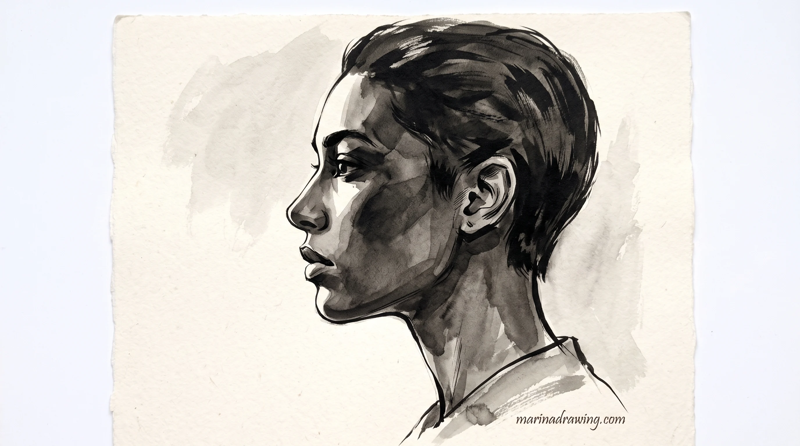
A three-quarter face is a perspective problem before it is a portrait problem. Basic scene perspective explains why the far eye is narrower.
 Pin it
9. Treating symmetry as the goal
Real faces are not symmetrical. Forcing symmetry that is not in your photo is a placement error in the other direction. It makes the drawing less accurate, even though it can look more finished.
10. Measuring with your eyes instead of a tool
Eyeball the distances and small errors pile up across the whole face without any single one getting caught. Use a pencil at arm’s length, a grid, or a simple proportional check.
The last two survive longest, because they feel productive while they happen. It is the same trap hand drawing sets when one finger gets finished before the palm is placed.
These two also cost the most time. A marked drawing from a graded drawing course ends that loop quickly.
 Pin it
11. Working one area to completion first
Finish one eye in full detail and it becomes the anchor everything else gets measured against. If that eye sits slightly wrong, the whole face inherits the error.
12. Not stepping back to view the whole face
Work close to the page for an hour and you stop seeing how features relate at normal viewing distance. Errors invisible up close are obvious from three feet away.
Most of the twelve trace back to one root cause. You judged a feature on its own instead of against its neighbours.
Fix that habit and you resolve more of this list at once than you would by chasing any single mistake.
The twelve do not carry equal weight. Numbers one, three and four cascade into everything you draw after them. Numbers seven to twelve are workflow, so they are easier to fix once caught, and just as capable of undoing an accurate drawing.
Here is how I audit a finished pencil sketch. Go through the twelve in order and answer each as yes or no.
“Did I place the eye-line at the halfway point of the head, or just the face?” You can answer that in seconds. “Does my portrait look right?” you cannot. It is too broad to act on, which is exactly why a numbered list beats a general impression.
Knowing the four rules is one skill. Getting honest feedback on whether your specific drawing follows them is a second one, and a list of rules cannot give it to you. That takes someone looking at the actual page and naming the measurement that is off.
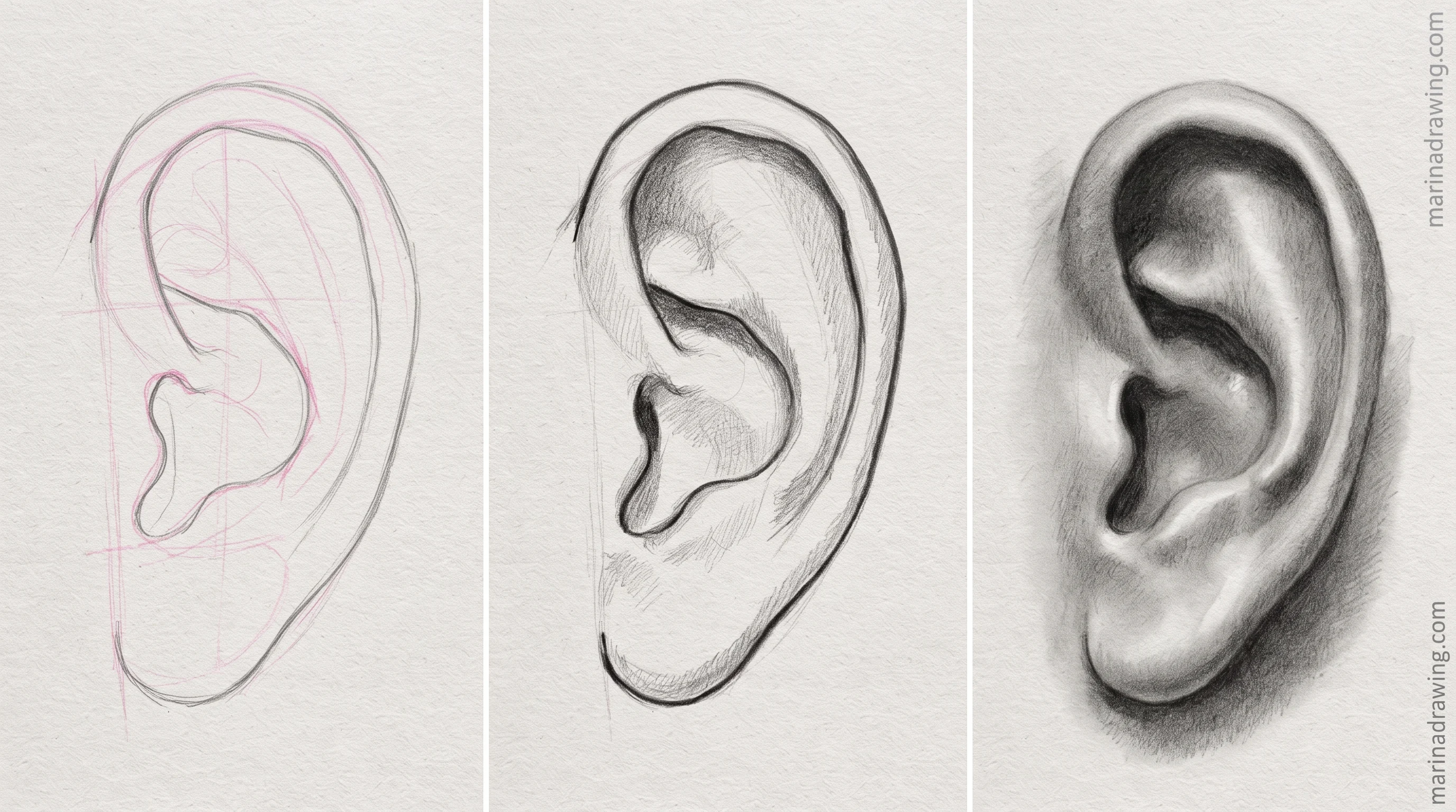
Most of these mistakes show up first in small features, which is why drawing eyes on their own is such a useful diagnostic before you commit to a whole face.
Working through the list alone takes a long time, because the mistake you cannot see is the one still costing you likeness. A graded drawing course names it in one pass.
Tone habits follow the same pattern. Shading a simple form first is the fastest way to separate a placement problem from a value problem.
What Correct Placement Looks Like
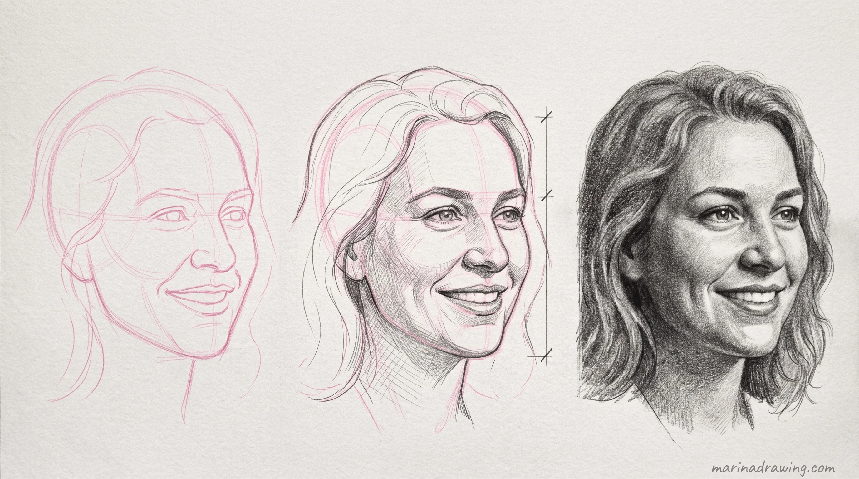
Three checks confirm placement before you shade. Each gets easier to trust once someone has confirmed your reading a few times, and that is the role a graded drawing course plays here.
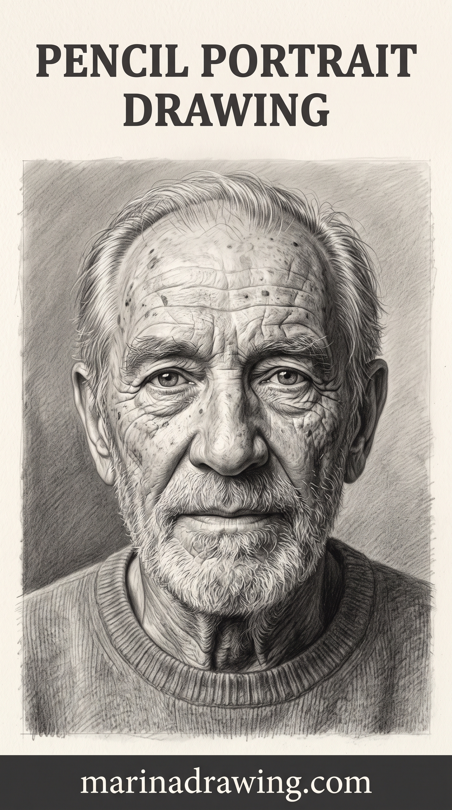
A portrait with correct placement does not look “better” at first glance. It looks like the person in the photo.
That is the real test. Not whether your drawing is skilled, but whether someone who knows the subject recognises them instantly.
Likeness comes from relationships between features, not from any single feature drawn well. A beautifully rendered eye on a face with a wrong eye-line still will not read as the person in the photo.
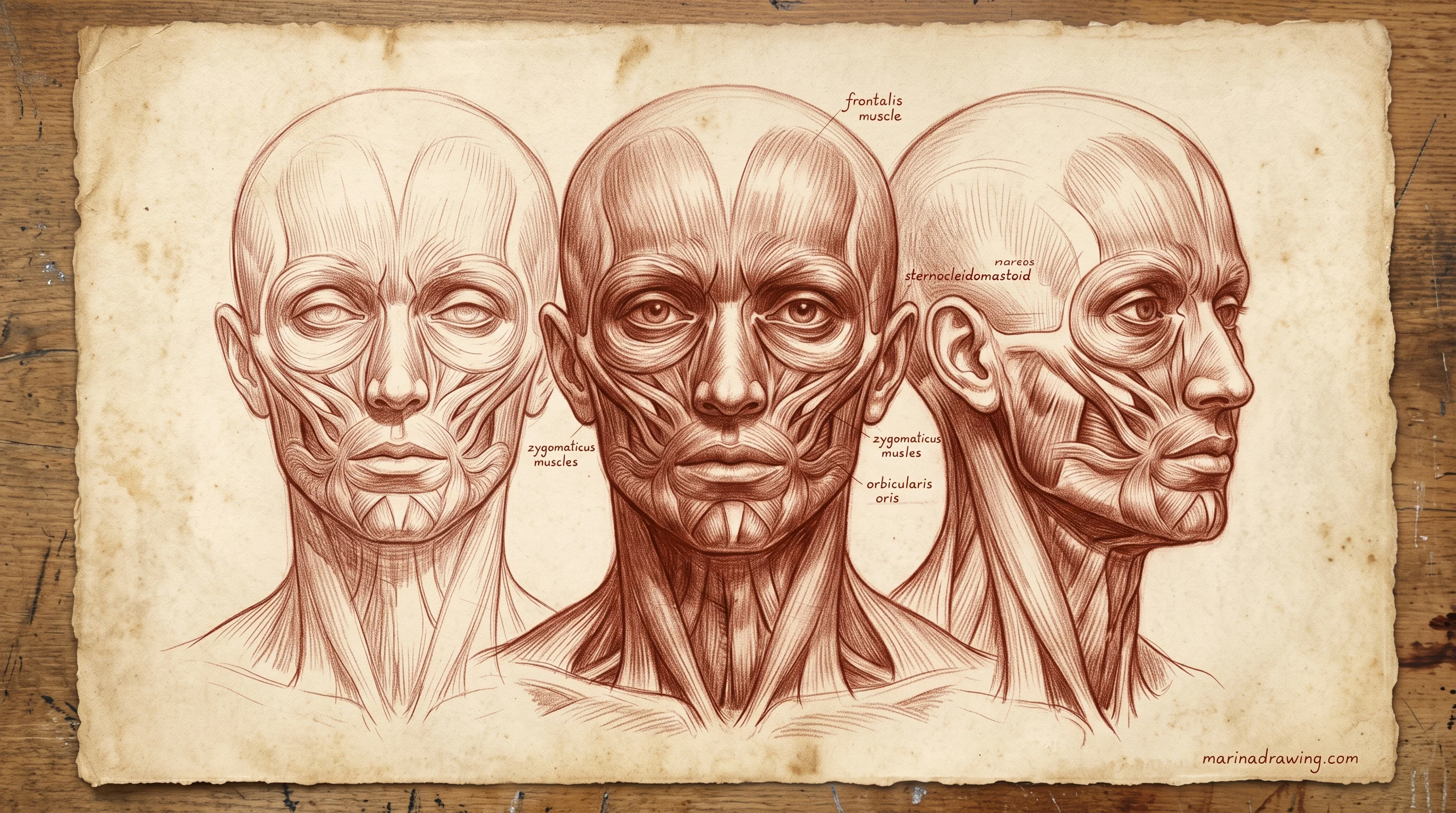
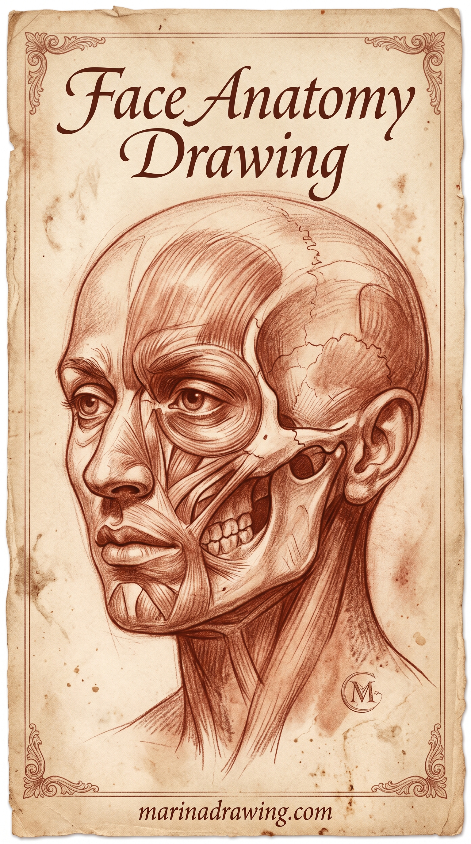
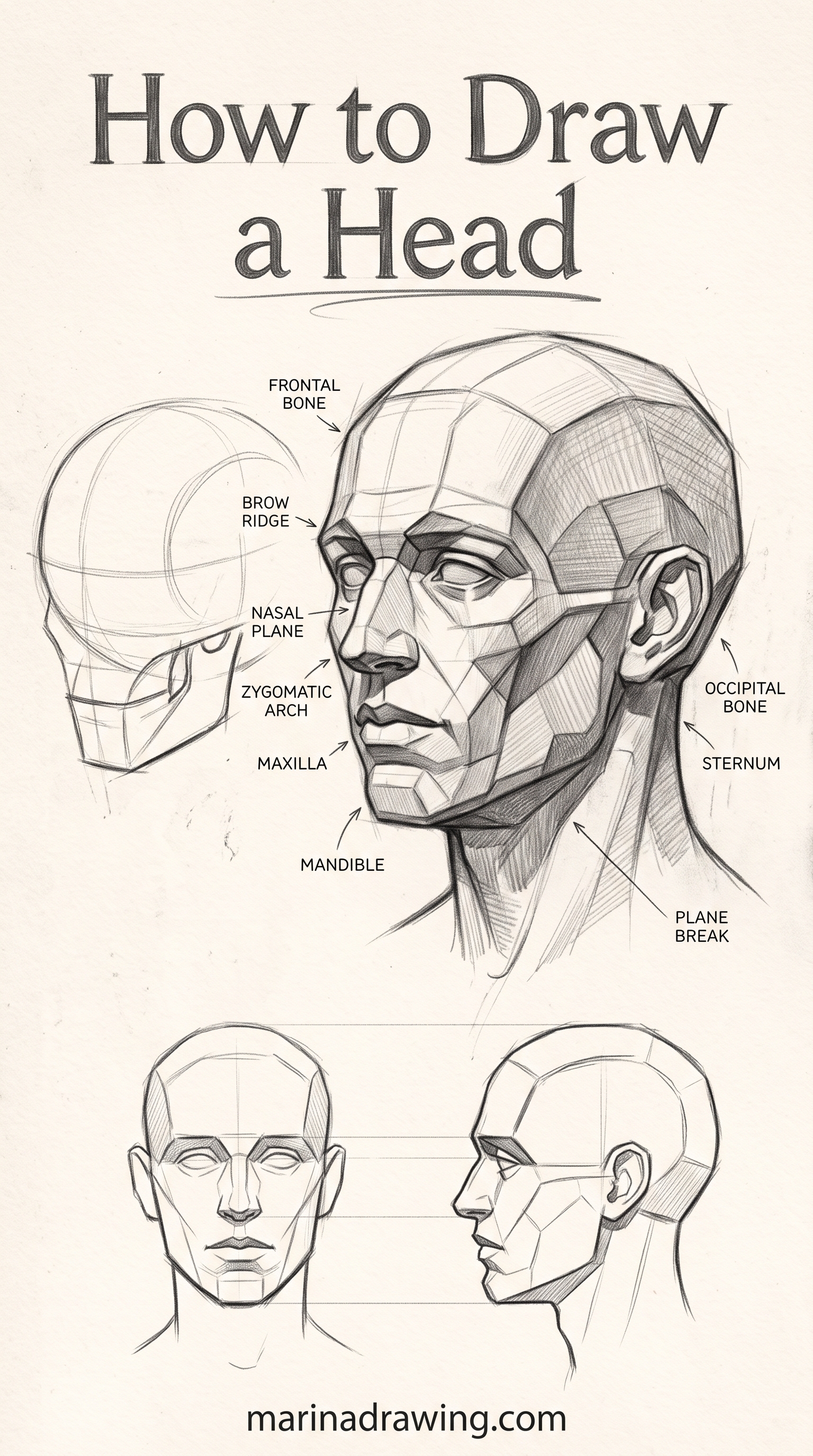
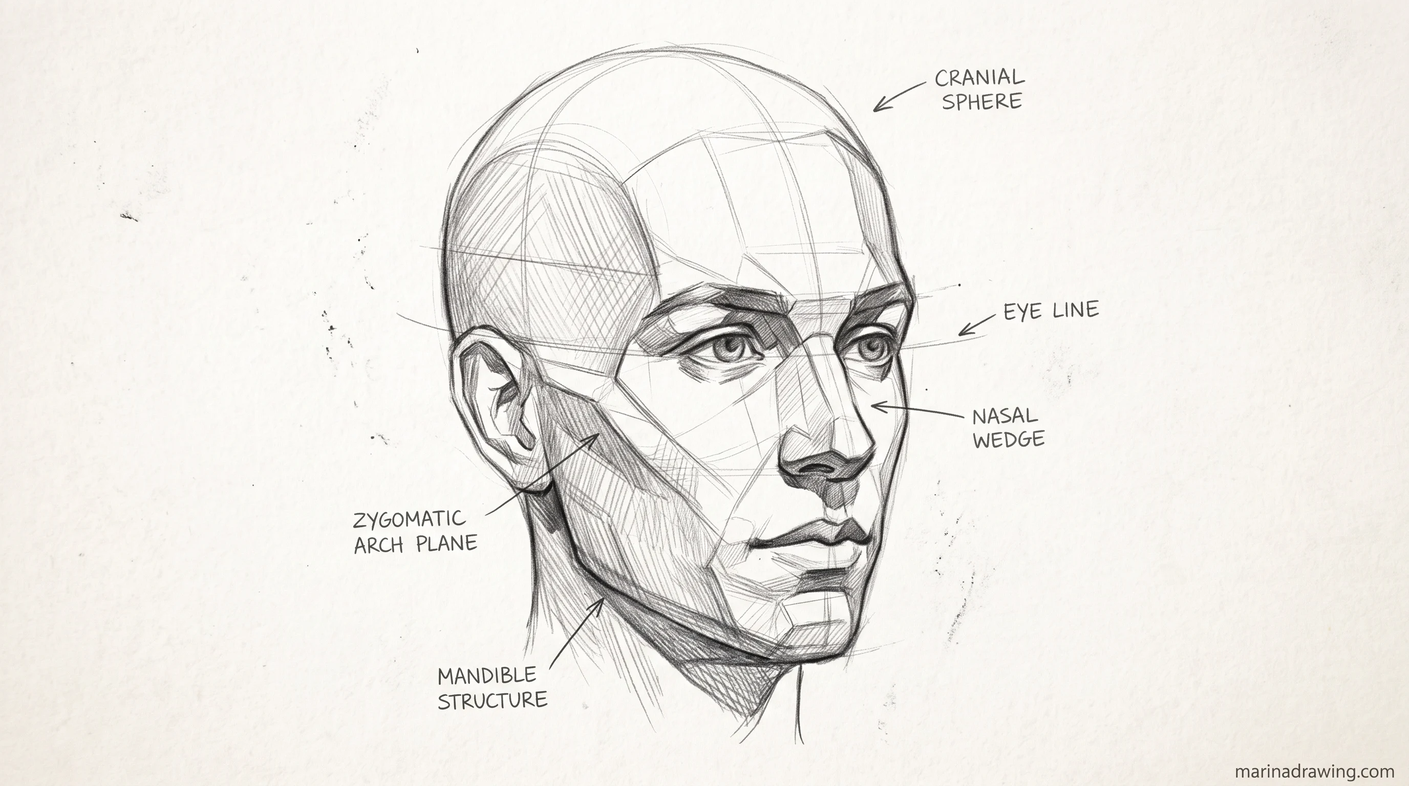
The same relationship-over-rendering rule holds for facial anatomy. See how the underlying structure shapes every feature, and how shading only reads correctly once placement is right.
This is why a technically skilled drawing can still fail to look like its subject. It is also why a rough sketch with correct placement often reads as more accurate at a glance.
The fastest test costs a minute. Hold your pencil sketch next to the reference at arm’s length and compare the four measurements, one at a time, before you add a single value of shading.
A drawing that passes all four is worth finishing. One that fails any of them is worth five minutes of correction now instead of an hour of shading you will rework later.
None of these checks need a teacher. What they eventually need is someone confirming that what you see is really there, and a graded drawing course is the cheapest version of that second opinion.
A third check costs nothing and catches what the other two miss. Turn the drawing upside down.
I do this on every portrait before I shade, and it still catches me about one time in three.
Inverted, the face stops being a face and becomes a pattern of distances. A misplaced eye-line your eye politely corrected ten minutes ago suddenly looks obviously wrong. Photographers and sign painters use the same trick, for the same reason. Your brain stops helping.
Run the three checks in the same order every time and placement stops being a question of confidence:
- Arm’s length — compare all four measurements against the reference, one at a time.
- Half covered — isolate each side of the face to find which one carries the error.
- Upside down — read the drawing as shapes, not as a person, and see what your eye was forgiving.
All three happen before a single value of shading goes down. That is the whole point. Corrections on faint marks cost you a minute, and the same corrections under an hour of rendering usually never get made at all.
My own error almost always lands on the side away from my drawing hand.
The half-covered check deserves a note. Lay a sheet of paper over one side of the face and compare only the visible half against your reference. It shows you whether one side carries most of the error.
Reading an angled face correctly takes the longest to build on your own. It is the most common thing people bring to a graded drawing course after the four rules stop being enough.
Angled references do this to everyone. The near side of the face is easier to measure than the far side, so check both separately instead of judging the face as one symmetrical unit.
A drawing that fails the check is not a failed drawing. It is a drawing that needs one more round of correction before shading locks everything in.
Treat placement as a pass or fail gate, not a judgement call. That is what turns “this doesn’t look right and I don’t know why” into “the nose base is too high, and here is how I know.”
The checks work on paper. Applying them to a drawing you are attached to is harder, and an outside marker inside a graded drawing course removes that bias entirely.
That shift in language matters more than it looks. “Doesn’t look right” has no next step in it. “The nose base is too high” points straight at rule three and at the correction to make.
If the three checks keep pointing at the same rule drawing after drawing, that is a habit, not an accident. Habits are what structured feedback in a graded drawing course catches in a week rather than a year.
 Pin it
 Pin it
Frequently Asked Questions
Why does my portrait look off even though I copied the reference closely?
Copying the outline reproduces a shape, not the placement relationships underneath it. Check the four rules against your own sketch, not against the photo.
How long does it take to get portrait placement right consistently?
Most people see a real change within a few weeks of checking all four rules on every attempt. The skill is in the checking habit, not in years of practice before results show up.
Do I need to learn facial anatomy to draw a good portrait?
Not to start. The rules above work from external measurements, not muscle or bone names. Anatomy becomes useful later, once placement is already reliable.
Should I draw from a photo or from life?
Either works for practising placement. A photo removes the difficulty of a moving subject while you are still learning to check measurements, so you get more useful repetitions early on.
What if my reference photo has an unusual angle or lighting?
The four rules still apply, but the measurements shift with the angle. A three-quarter view compresses the far side, so the eye gap and nose width there read as narrower. Check the rules against what your photo shows, not against a memorised straight-on proportion.
Why does one side of my portrait always look better than the other?
You have a dominant hand and a habitual scanning direction, so one side gets measured more carefully without any conscious choice. Covering half the face during the check is the direct fix. It forces the weaker side to get the same attention.
Is it normal to redraw the same portrait several times before it works?
Yes, and it is more efficient than it feels. A second attempt with all four rules checked from the start usually takes less total time than a first attempt where errors surface late. The redraw is the placement check applied earlier.
Can I use these rules for a self-portrait in a mirror?
Yes, with one change. Work from a photo of yourself rather than a live mirror. A mirror image shifts as your head moves, which makes the four measurements unreliable to check twice in a row.
The questions above come up in every beginner portrait thread. The ones about your own drawing are what a graded drawing course answers directly.
What is portrait drawing, exactly?
Portrait drawing is drawing a specific person so they are recognisable, not drawing a generic face. That distinction is the whole discipline. A well-drawn face nobody recognises has failed, and a rough sketch everyone recognises has succeeded.
What pencils are best for portrait drawing?
An HB for all placement work and a 2B to 4B for shading covers every drawing in this guide. Harder grades stay light enough to erase cleanly while you measure. Softer grades give you dark values without denting the paper.
Is portrait drawing something you can learn easily as a beginner?
The measuring part, yes. You can learn the four rules in an afternoon and they carry most of the likeness. The rendering part takes longer. Separating the two is what makes early progress feel fast instead of hopeless.
How much practice does portrait drawing actually take?
Placement accuracy usually settles after twenty to thirty measured portraits, because you are training one repeatable check rather than a general skill. Shading keeps improving for years, so bank the placement win first.
If the four measurements keep coming out right and your portraits still feel flat, placement is no longer your bottleneck. Shading is. That is the moment a graded course with feedback on your own pages is worth the money, and not before.
What does portrait drawing mean, and what does it capture?
It means drawing a specific person so they are recognisable. What it captures is proportion and relationship: the distance between the eyes, the height of the nose base, the width of the mouth. Likeness lives in those measurements, not in the rendering.
What are the best portrait drawing books for beginners?
Any book that spends its first chapters on head construction rather than on rendering hair and skin. Skip anything that opens with finished galleries. The useful ones show the measuring stage, half-finished and ugly, because that is the part nobody photographs.
How do you do portrait drawing the easy way?
Draw the head shape, mark the eye line at half the head height, then the nose base and mouth by the fractions above. Only then draw a feature. The easy version is not a simpler face, it is a stricter order.
Is portrait drawing good for kids to try?
Yes, with one change. Skip the measuring and let them draw the face as big shapes. Simple drawings for kids work better at that stage. The four rules are a correction tool for someone who already notices their drawing looks wrong.
Placement is the one part of a portrait you can check rather than feel. When the four rules stop being a checklist and start being the way you see a face, likeness follows on its own. If you want someone marking which rule is off in your own drawings while that happens, a graded drawing course is the shortcut.